The recontextualization and aggregation of Modernism is the essence of the innovations of music, album art, and the supporting subcultures that emerged from 1968-1982.
“ I never know which version I’m going to be
I seem to have so many choices open to me.”
– Wire. 40 versions 154. Pink Flag Records, 1979
As a child in the 70s, my parent’s record collection had a lasting impression on me. In the hazy environment of a psychedelic-soul and funk-flavored household, I would gaze for hours at the colorful imagery of the gatefold record-covers while the sounds from my dad’s stereo-geek system permeated my senses. Beginning in my teens, my discovery of the zeitgeist of punk and its peripheries had its intended deconstructive effects on me, and expanded my perspective on music, the imagery associated with it, and the supporting subcultures that surround them to fortify a vital gestalt foundation for my creative process.
Now as a designer armed with research and critical thinking, I’ve been able to place these creative novelties and objects in a socio-cultural context; a postmodern popular culture in a consumer/corporate neoliberal society. I’ve embarked on an analysis of this particular era of the late 20th century in order to explore its history and characteristics, and the subsequential philosophies that lay the groundwork for popular culture in the last 40 years.
Aside from years of listening to music, researching informed music critique, and curating and producing art, music, and culture events at Revoluciones Collective Art Space, critical literary theory provided me with additional analytical tools to create a dialogue about these creative products within the context of the postmodern condition. For better of worse, I myself unwittingly contributed to the wane of subcultures in my hometown of Denver through homogenization and commodification; siphoning them through a proto-hipster, late-capitalist fetishization of surfaces.
At a talk at the Whitney Museum in 1982 entitled, Postmodernism and Consumer Society, Frederic Jameson, describes postmodernism as the crafting of pastiche:
“Pastiche is, like parody, the imitation of a peculiar or unique style, the wearing of a stylistic mask, speech in a dead language: but it is a neutral practice of such mimicry, without parody’s ulterior motive, without the satirical impulse, without laughter, without that still latent feeling that there exists something normal compared to which what is being imitated is rather comic. Pastiche is blank parody, parody that has lost its sense of humor: pastiche is to parody what that curious thing, the modernpractice of a kind of blank irony, is to what Wayne Booth calls the stable and comic ironies of, say, the 18th century.”
In Jameson’s view, pastiche is the appropriation of past styles, ideas, and themes into a centerless and hollow spectacle. Pastiche can be seen as one of the principle concepts of the postmodern perspective. By borrowing objects from modernism, postmodern culture recontextualizing them as a surface decoration.
In 1971, David Bowie heralded in Warhol’s vision for a brave new world with a song called “Andy Warhol”, by accentuating the surfaces and poses of Warhol’s factory, and simultaneously revealing the hybridity of the artist and his artistic creations.
“Dress my friends up just for show
…
Andy Warhol looks a scream
Hang him on my wall
Andy Warhol,
Silver Screen
Can’t tell them apart at all”
– David Bowie (1971). Andy Warhol. Hunky Dory. RCA Records
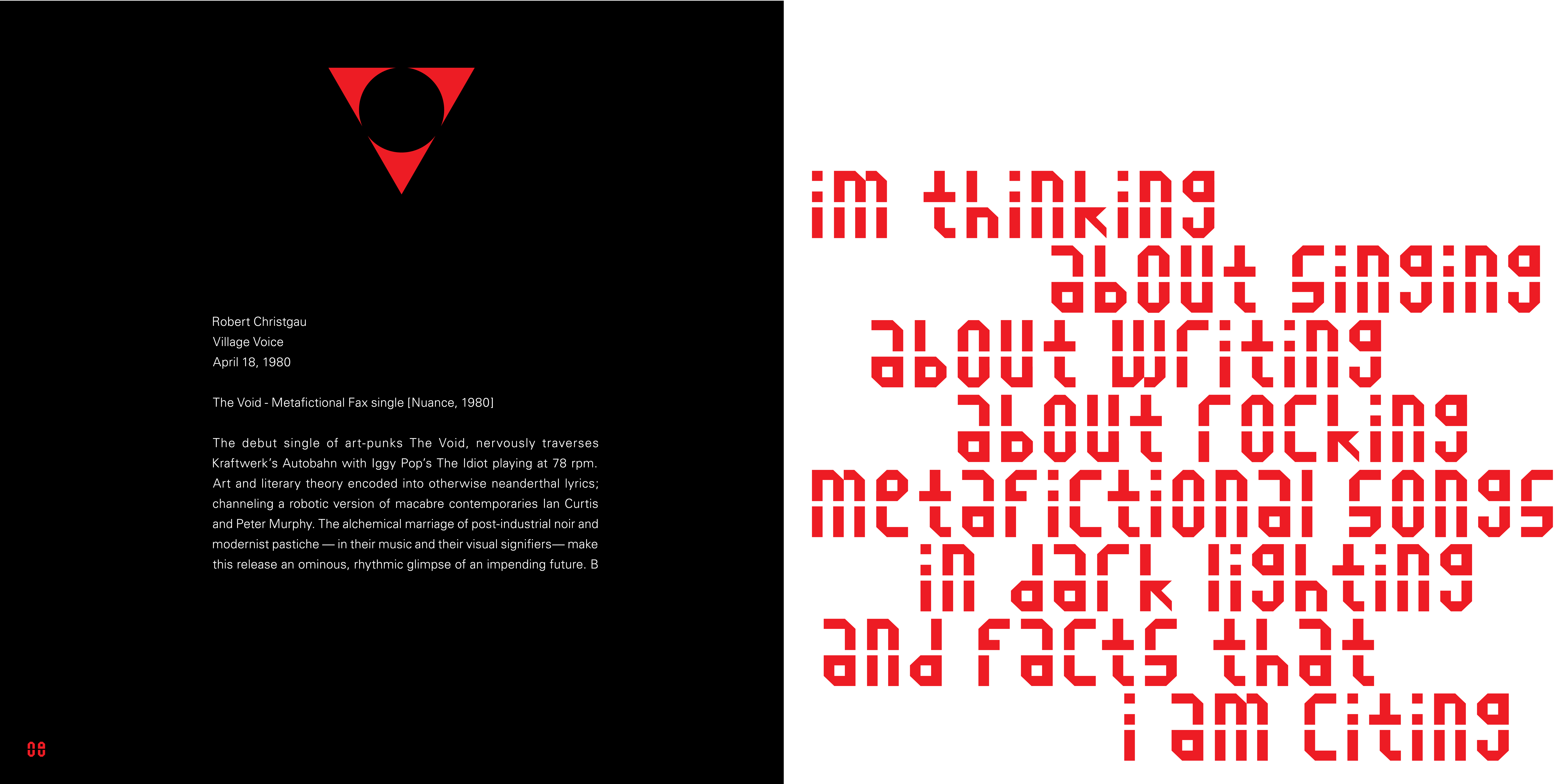
The following year, David Bowie released what I consider to be the first postmodern record, entitled The Rise and Fall of Ziggy Stardust and the Spiders from Mars. The rockstar, making a record about a rockstar, was the first of its kind in a disillusioned industry recovering from the mass hallucination of the 60s. Bowie sought to create a character whose music was highly influenced by Lou Reed, that had the style and swagger of Iggy Pop, and was an alien who predicted that mankind would face it’s apocalypse in five years.
Ziggy Stardust was a tragic tale of substance abuse and the struggle with fame which Bowie himself would ironically fall victim to during the touring and performing of the album. The line between the artist and his art began to blur, and reality and fiction became indistinguishable for Bowie. This confusion of life and fiction is sometimes called hyperreality. In Simulacra and Simulation, French sociologist Baudrillard defined “hyperreality” as “the generation by models of a real without origin or reality.” (Baudrillard, Jean (1994). Simulacra & Simulation. University of Michigan Press. p. 1.)
Over the next five years, Bowie would constantly redefine himself, his productions, and continue to devise new characters and themes for each of his albums. To Bowie, these characters reflected aspects of his own personality, and allowed him to fragment his own identity for the sake of a public spectacle. Along with the corresponding characters, each album had its own mode, and Bowie often self-consciously collected styles from various sources without shame; wearing his influences on his laced sleeve. His music was a bricolage of folk, art-rock, psychedelia, glam, proto-punk, and eventually his own brand of Philly Soul. In 1975, tBowie released the Young Americans album, and became the first white performer on Soul Train. As the Thin White Duke, he took key snippets of the black American R&B style and sutured them up into what he called “Plastic Soul”, a fitting appellation for his slick-surfaced simulation. Bowie’s postmodern styles and influence from the 70s would extend into the 80s along with that of other musicians, artists, and authors.

In the late 1960s, near the beginning of the history of the diaspora of black electronic music, dub was a prime example of the co-evolution of technology and postmodern art forms. Jamaican DJs such as King Tubby and Lee “Scratch” Perry spliced audio tape loops and began to strip down reggae tracks to their bare rhythmic elements, the bass and drum, and reintroduce the guitar and vocals into analog minutiae as texture. They called these tracks versions, and eventually these versions would appear as b-sides to many reggae record singles. The dub versions would then spawn their own versions, and versions of those versions. Dub versions can be seen as akin to Baudrillard’s simulacra; copies of copies.
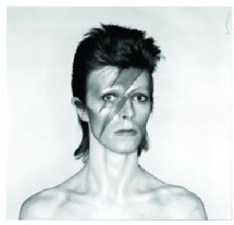
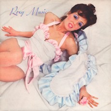
In the early 1970s, many rock bands reacted against the ideals of the flower-power music landscape by subversively extracting the signifiers of rock ‘n’ roll culture and wearing them as playful fashion.In 1972, English art-rock band Roxy Music released their self-titled debut with mixed referencing of multiple styles, riffs, and nods to rockabillies original template, pompadours, ironic rockstar cliches of costume stage wear, and frontman Bryan Ferry’s neo- Sinatra crooning and his entire ironic lounge singer style. The album art was designed as an homage to 50s pin-up models. In an attempt to elevate pop into an art avant-garde, Roxy Music added theatricality and a dissolution of identity to an exhausted popular idiom. The opening track, Remake/Remodel, declares their modus operandi by referencing, through each instrument’s solo in a jazz-style breakdown, random,discrete musical bits. The guitar recalls the Peter Gunn Theme, “Day Tripper” by the Beatles on bass, and the horns of Wagner’s “Rise of the Valkyries” are mimicked by Andy McKay on sax. A look at the lyrics, delivered in Ferry’s neo-Sinatra crooning, reveal what seem to be a typical rock/pop theme of the narrator and his female love interest, but delivered with female signifiers describing an automobile.
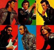
Upon getting fired from Roxy Music in 1972 for stealing the glory from frontman Bryan Ferry, Brian Eno embarked on a solo career that would position him as a renaissance postmodernist. Taking cues from the 60s avant-garde leaders such as Lamont Young and John Cage, Eno explored music from an non-musical approach that was rooted in artistic processes, chance, and systems. Inspired by Steve Reich’s tape recorder manipulations, Eno began to compose what he called “sound paintings” with collages from bits of reel-to-reel tape recordings. By applying non-musical sounds and blending them into pop music structures, Eno subverted the high / low cultural boundary with a vision of what art could be. By the mid-seventies, Eno was producing music with David Bowie and David Byrne (Talking Heads) which juxtaposed samples of field recordings and Middle Eastern and African rhythm and textures with western pop song structures.
These were extremely prolific and innovative times for all involved, but their outputs weren’t received without criticism. Accusations of neo-colonialism were thrown at albums such as David Bowie’s Lodger, and David Byrne and Brian Eno’s My Life in the Bush with Ghosts where white Brits and Americans appropriated music of the Third World for their own ends. This brings to mind Poststructuralist Edward Said’s notions of Post-colonialism and criticisms of Western culture’s bias, abuse, and misunderstanding of Eastern cultural artifacts.
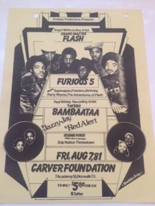
By the early to mid-70s, Jamaican-born dj Kool Herc used two turntables and two copies of the same funk record and began to cut them back and forth to extend the “break”, the rhythm breakdown in the track, and create a style that was intended to prolong the dance sequences of dancing crews in the Bronx. (Frick, Jim & Ahearn, Charlie (2002). Yes Yes Y’all: Oral History of Hip-Hop’s First Decade. Da Capo Press. 24-43.) Soon other djs such as Afrika Bambaataa and Grandmaster Flash followed suit, blending funk and soul records with an audio mixer, using the “scratch” technique as rhythm and texture, and pioneering sampling as defining characteristics of the burgeoning Hip-hop genre. From this launching point, sampling became a vital basis for many genres of music for years to come. Besides the legal ramifications of the sampling of copyrighted material, these sound bricolages were frequently the object of criticism and denounced as inauthentic and contributing to the crisis in historicity. This weakening of historicity was described by Fredric Jameson:
“The exposition will take up in turn the following constitutive features of the postmodern: a new depthlessness, which finds its prolongation both in contemporary “theory” and in a whole new culture of the image or the simulacrum; a consequent weakening of historicity, both in our relationship to public History and in the new forms of our private temporality, whose “schizophrenic” structure (following Lacan) will determine new types of syntax or syntagmatic relationships in the more temporal arts.” (Fredric Jameson’s Postmodernism, or, The Cultural Logic of Late Capitalism. Duke UP, 1991.)
While much has been written and discussed about the reinvention of rock ‘n’ roll with the seventies punk movement, the visual aspect of record sleeves and poster designs of this era and their pastiches of older generations’ design objects deserve examination and research for this paper in order to place them in the context of postmodern industrial and graphic design.
The bulk of the initial punk explosion’s designs were derived from the European avant-garde of the early twentieth century. As with a majority of postmodernist designs, there was an all-out invasion of material from the modernist establishment to suit the purposes and repurposing of ideas and aesthetics for a new identity. The DADA art movement, which was decidedly anti-art and anti-idealist, provided a wellspring of subversive material to be used as signifiers for the punk rebellion.
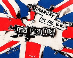
British artist and designer Jamie Reid applied the DADAist language of the cut-up technique infused with a ransom note-styled use of text to create The Sex Pistols logo. An anarchist, armed with the Situationists’ taste for revolution, Reid found a compatriot in The Sex Pistols creator Malcolm McLaren. McLaren, who was co-owner of a clothingboutique called “Sex”, devised the concept of the band as a fashion business model rooted in the multi-disciplinary design and production structures of de Stijl and Bauhaus.
Reid produced promotional material and record sleeves for The Sex Pistols including the iconic ad poster for the Anarchy in the UK record single; one of the defining design elements of the entire British punk subculture. By making use of collage and photomontage methods, the designer spliced cut-out text, safety pins, and debased imagery of British politics and royalty.
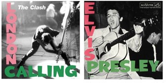
In reaction to the explosive chaos on British cultural society induced by The Sex Pistols, English punk rockers The Clash declared the reconstruction of rock ‘n’ roll. In order to simultaneously subvert and pay homage to the original rock ‘n’ roll image, The Clash employed graphic designer Ray Lowry to design the cover art of their London Calling album. Lowry exploited the cover art of Elvis Presley’s debut album by matching the color and style of the type, and replacing the photo of Elvis with a monochrome image of The Clash’s bassist, Paul Simonon smashing his bass onstage; effectively destroying the rock ‘n roll idiom.
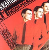
In 1978, German designer Karl Klefisch captured the spirit of production ideals in Russian Constructivism for use as album design on The Man-Machine by New Wave progenitors Kraftwerk. Klefisch was largely inspired by the designs of Russian artist El Lissitzky, and employed Lissitzky’s groundbreaking use of sans-serif modernist typography, inclined lines, space, color, and geometric elements. Klefisch was able tosuccessfully reflect the artistic aesthetic of the relationship between humans and their technology that Kraftwerk were expressing through their music.
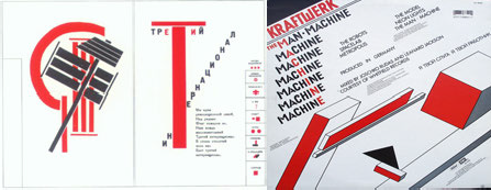
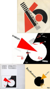
Lissitzky continued to be an important reference point for the visual aspects of the punk, post-punk, and new wave scene of the late 1970s to the early 80s. In the UK, graphic designer Barney Bubbles, who is also credited for The Damned’s debut album cover Damned Damned Damned, applied Lissitzky’s styles to his cover art for Generation X’s first single, Your Generation. Again, Lissitzky’s hallmark use of inclined bold text, space, and black & red geometric shapes are emulated here in order to annunciate the arrival of the new reign of rock music.

The primary colors, geometric shapes, space, and inclined text of Lissitzky’s Beat the Whites with the Red Edge has proven to be an inspiration for the visual style of the post-punk/new wave subculture in two generations. Scottish band, The Wake, used the artwork for their twelve-inch single Something Outside in 1983. On the light-gray album cover, Lissitzky’s image was placed into a rectangular white space with the band name as a header, and all of the Russian type was removed. The band Franz Ferdinand, New Wave revivalists in the 2000s, based their design for their single This Fire on this same Lissitzky poster. As with The Wake album, the slogans were removed, and the most essential elements were retained including the triangle piercing the circle as the central graphic element. The reappropriation of New Wave revivalist stylings by 21st century bands of their predecessor’s appropriations marks a fine example of Jean Baudrillard’s notion of simulacra, copies of copies, and meta-design.
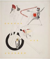
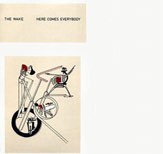
Additionally, The Wake lifted Lissitzky’s Part of the Show Machinery, and applied it to the cover of their Here Comes Everybody record in the same fashion as the previous record design. The text was again removed and replaced with the band name and record title. The reuse of El Lissitzky’s posters as album art for The Wake was appropriately well-received in the design atmosphere of their Factory Records label.
The romanticism of Modernist production ideals was clearly evident in the foundational aesthetic of Manchester’s Factory Records. With Peter Saville, Factory Records recruited the premier postmodern designer. Saville ransacked the modernist canon of it’s Constructivist, Suprematist, and Futurist elements, and triumphantly repurposed them as symbols for the merging of pop and the avant-garde. Saville started things off with a bang, creating distinct design objects for the nascent record company’s small collection of bands.
His first project for Factory was a concert poster that was notoriously finished on opening night. “Fac 1, marks the beginning of the Factory Catalogue. Appropriating diverse sources including the typographic characteristics of Jan Tschichold’s Die Neue Typographie (1928), the colour scheme of the UK’s National Car Parks, and a warning sign from Saville’s college workshop, it was designed to advertise the first four nights of the Factory club.” (Robertson, Matthew. Factory Records: The Complete Graphic Album (Chronicle Books: San Francisco, 2007), 19.)

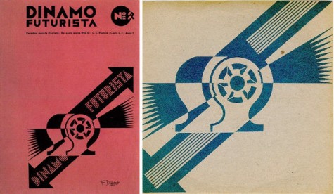
Saville showed his fondness for Italian Futurist design when he employed select works by Fortunato Depero for the band New Order’s records covers. On Martin Hannett’s last production work for Factory, New Order releasedProcession/ Everything’s Gone Green on seven-inch vinyl. This album single marked the exact transition moment for the band as they rose from the ashes of Joy Division.
Implementing the influences of the New York dance underground, the record was a prototype for the new electronic sounds that would define New Order for the rest of the decade. Peter Saville took the opportunity to apply a distinct visual style to the forward- thinking mode that the band was embracing. When he clipped the primary graphic element from Depero’s Dinamo Futurista magazine, Saville applied it edge-to-edge on the record sleeve, omitted all typographic elements, and extended the inclined lines to the edges of the graphic symbol.
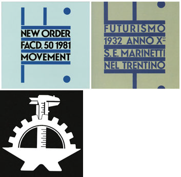
The follow up record, New Order’s first full length, Saville again borrowed from Depero’s canon. 1983’s Movement was a copy of Depero’s Futurismo 1932 poster, with minor changes that were limited to the typographic content and color. The graphics were also resized the fit on the center of the album without the bleed-off on Depero’s poster.
Saville also created a logo for Factory that was inspired by a symbol he found in an old Italian print magazine. The logo subtly bears the initials of Factory Communications, LLC within it suggested by the shapes of the tools. This logo again carries the ideal of industry and production that was an essential marker of the label’s brand identity.
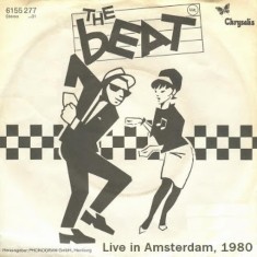
The use of Modernist design elements were applied in the visual identities of other subcultures in Late 70’s to early 80’s UK. The designers of 2-tone records favored Swiss typefaces and the use of space and minimal color. 2-Tone, with it’s celebration of racial unity, was a pastiche of 60s British Mod, Jamaican ska styles in the scene’s music sound, design objects, and fashion sensibilities. As one of the first revivalist subcultures, 2-Tone effectively made use of previous generations’ styles as homage, but also with the use of kitsch as a form of pastiche remodeling.These scenemakers took snippets of dancing mod girls and Jamaican rude-boys as visual signifiers and checkerboard motif came to symbolize the multiculturalism of the movement.
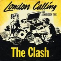
Kitsch, one of the defining elements of the postmodern, was another recurring theme in several record sleeves of the the Punk/New Wave era. After designing the London Calling LP for the Clash, Ray Lowry also designed the sleeve for the London Calling single in the same spirit as the full-length. This time, Lowry took the illustration of60’s teenagers listening to records from the cover of an old Columbia Records 78 rpm design and altered the image by adding rock ‘n’ roll classics as well as punk titles in the blank spaces left on the depictions of records.
My research has led me to the conclusion that our culture’s fascination with nostalgia has led us to a surface representation of the past that has effectively replaced the real, and late-capitalism promotes these surface spectacles as commodities. The examples provided here are indicative of a certain mode of interpreting the reality of life and the resulting culture in the post-industrial Western society with its rapidly evolving technologies and floating signifiers. As the term “postmodernism” and it’s descriptors have become exhausted by the dawn of the 21st century, a review of the innovations of creatives like Andy Warhol may provide clues as to a remedy for the postmodern condition. It is my opinion that Warhol successfully straddled the modern and postmodern worlds by having one foot planted in each. For example, Warhol accomplished this by retaining modernist values such as color, composition, and painterly expressions in his work. By allowing a fine discrimination and inclusion of meta- narratives and metafiction alike, the reintroduction of a new authenticity may ease the tension between these two worlds.
