The construction of a manifesto for young designers in the twenty first century
In preparation for composing my own design manifesto, I researched several existing manifestos for inspiration, and in turn, employed them as useful reference material for comparison and contrast with my own finished, written manifesto. Beginning appropriately at the radical roots of art/design manifestos, I was able to formulate a voice based on Hugo Ball’s DADA Manifesto, and immediately followed with Marinetti’s Manifesto del Futurismo. The decidedly playful voice of DADA Manifesto, veering imperatively on the absurd in its audacity, and near the esoteric in its deconstruction of language, Ball delightfully inspired my approach to the challenge of composing a manifesto. “Dada Tzara, dada Huelsenbeck, dada m’dada, dada m’dada dada mhm, dada dera dada, dada Hue, dada Tza,” Ball incants. In my own work, when discussing can and can’t dos, should and shoudn’t dos, I impishly follow with the Frank Sinatra scat, “Do-be-do-be-do“; an absurd referential invocation of Ball’s conjurings in the almost occult poetry of DADA Manifesto. The repetition and alliteration of the introduction of my own manifesto is the logical progression of the DADAist poetic expressions. My explorations into the word manifest — meaning, obvious to the senses — is a direct nod to George Maciuna’s use of the word flux — also a noun, verb, and adjective — for the Neo-DADA declarations and rebellions of FLUXUS in the 1960s. In addition to DADA, I occasionally, and justifiably, dipped my pen in the inks of Guy Debord, and even Joe Strummer, in an attempt to subvert the monolithic hierarchy armed with ideas and words. My cheeky ode to coffee is an homage to the Situationist playfulness of Debord’s own sense of humor. The uppercase WE MUST, and verbiage such as “smash” and “liberate” suggest a punk-rock wake-up call, and an uprising against the corporate mafias. The authoritative, youth-driven, call-to-action expressions of Marinetti’s Futurist Manifesto provided me with the essential elements of excitable motivational language in which to effectively rein in my readers (design students, recent grads, and colleagues alike). The use of pop music lyrics as a device in my own manifesto, such as David Bowie’s own teenage call-to-arms Changes, effectively engages my readers with a cultural touchstone of revolt. My next task was to analyze the manifestos, primary design principles, intentions, motives, and views on which my own design education and training from where The Fashion Institute of Technology’s curriculum is rooted. In 1919, Walter Gropius effectively erased the line between designer and artist, yet a century later, the issue is reanimated in our current socio-cultural-economic situation. I address this deviance directly in the closing words of my manifesto, calling out curators and commerce, and a bold-faced defiance of FIT curriculum’s exalted Milton Glaser, in a rallying cry to a reunification of diverse media labels through the ethic of craftsmanship. The expressive and humanistic manner of manifesting the intentions and views of De Stijl in the Manifest I of The Style 1918, inspired the general structure of my manifesto, as well as the particular mode of expressing logical concepts. “The space between things is as vital as the things themselves. Positive implies negative, negative implies positive.” recalls the perennial notions listed by Theo van Doesburg such as “here is an old and a new consciousness of time. The old is connected with the individual. The new is connected with the universal.” Additional inspiration for my manifesto comes directly from First Things First 2000 that appeared in Adbusters magazine in 1999. Signed by Tibor Kalman, Rick Poynor, and others of the design intelligentsia of the day, the manifesto revisits its namesake manifesto and challenges consumerism, addresses the reduction of design to problem-solving, and the environmental, social and cultural issues that are critical issues in the 21st century. Admittedly, several of my directives were unconsciously parallel to this manifesto. After writing down the ideas and ideals that I felt are important for us as young designers to consider in 2019, I read First Things First 2000, and knew that I was on the right track to composing my own manifesto.

The execution of a manifesto
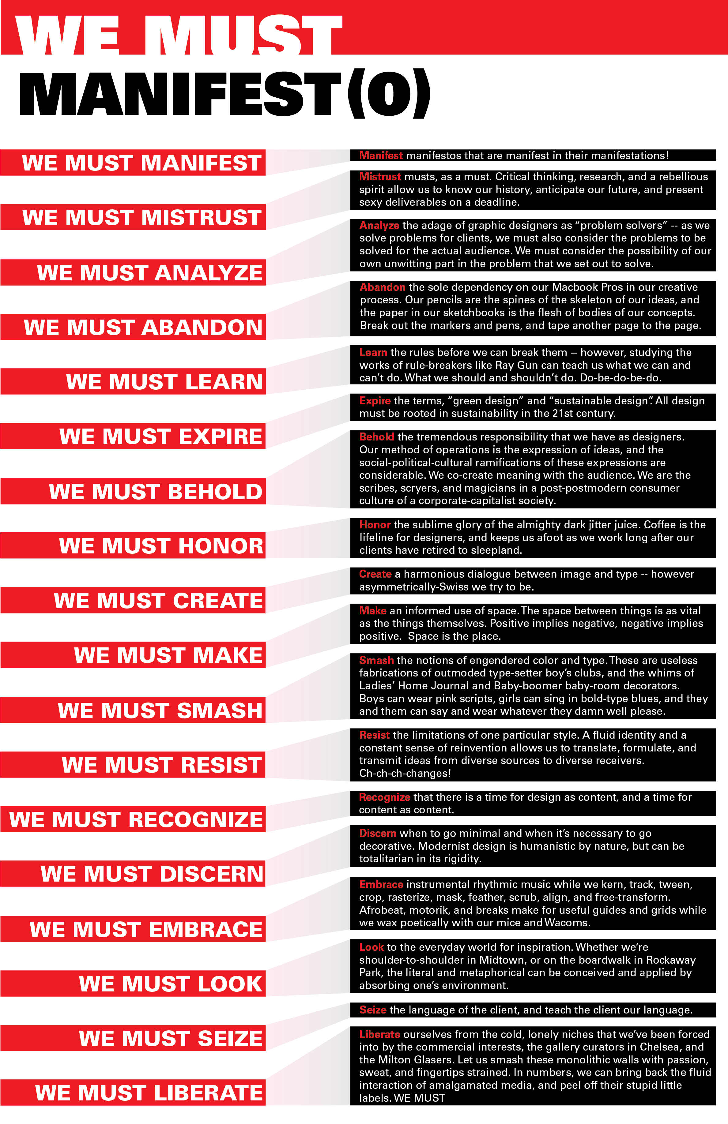
WE MUST manifest manifestos that are manifest in their manifestations!
WE MUST mistrust musts, as a must. Critical thinking, research, and a rebellious spirit allow us to know our history, anticipate our future, and present sexy deliverables on a deadline.
WE MUST analyze the adage of graphic designers as “problem solvers” — As we solve problems for clients, we must also consider the problems to be solved for the actual audience. We must consider the possibility of our own unwitting part in the problem that we set out to solve.
WE MUST abandon the sole dependency on our Macbook Pros in our creative process. Our pencils are the spines of the skeleton of our ideas, and the paper in our sketchbooks is the flesh of bodies of our concepts. Break out the markers and pens, and tape another page to the page.
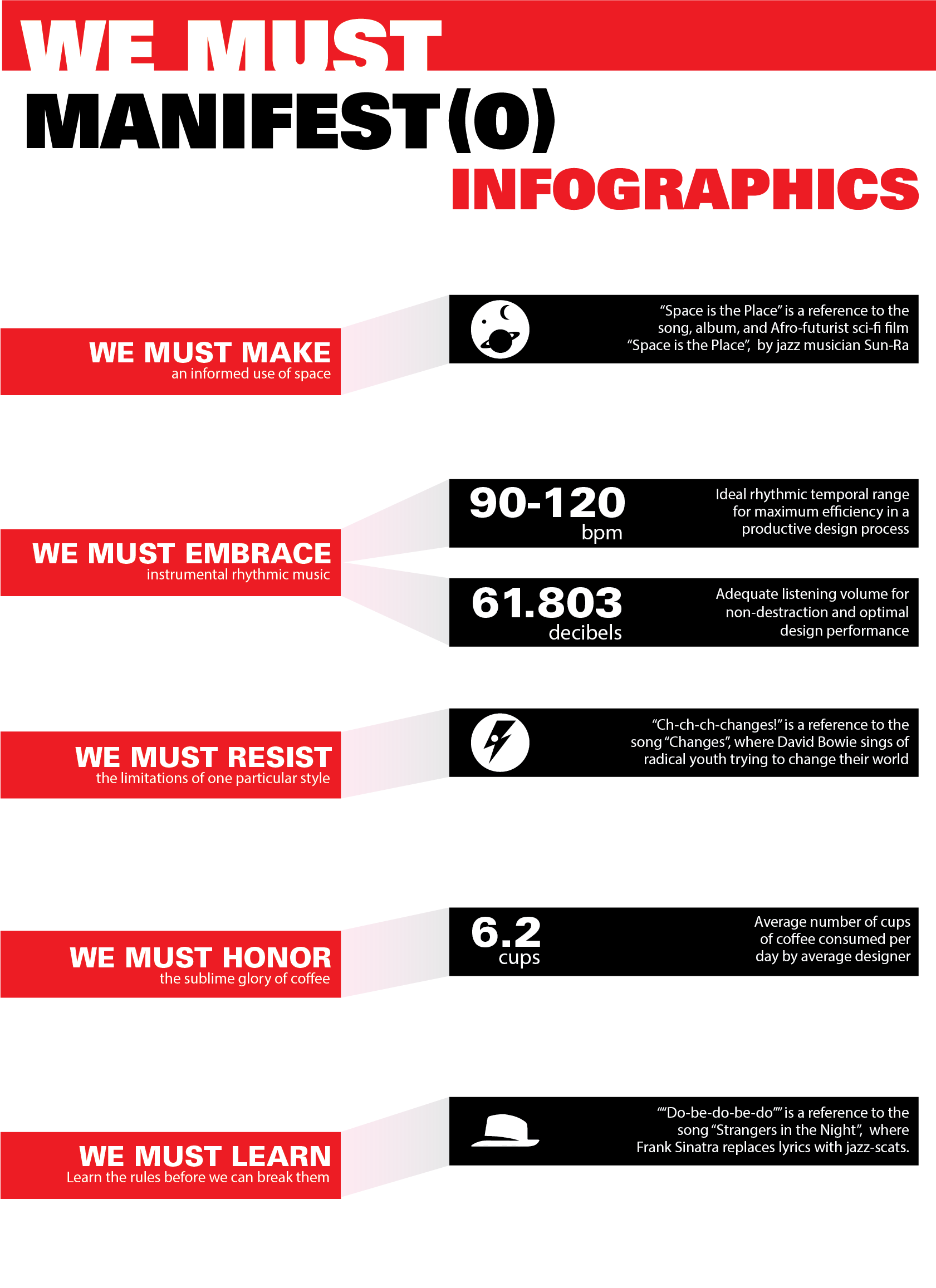
WE MUST learn the rules before we can break them — however, studying the works of rule-breakers like Ray Gun can teach us what we can and can’t do. What we should and shouldn’t do. Do-be-do-be-do.
WE MUST expire the terms, “green design” and “sustainable design”. All design must be rooted in sustainability in the 21st century.
WE MUST recognize the tremendous responsibility that we have as designers. Our method of operations is the expression of ideas, and the socio-political-cultural ramifications of these expressions are considerable. We co-create meaning with the audience. We are the scribes, scryers, and magicians in a post-postmodern consumer culture of a corporate-capitalist society.
WE MUST honor the sublime glory of the almighty dark jitter juice. Coffee is the lifeline for designers, and keeps us afoot as we work long after our clients have retired to sleepland.
WE MUST create a harmonious dialogue between image and type — however asymmetrically-Swiss we try to be.
WE MUST make an informed use of space. The space between things is as vital as the things themselves. Positive implies negative, negative implies positive. Space is the place.
WE MUST smash the notions of engendered color and type. These are unnecessary fabrications of outmoded type-setter boy’s clubs, and the whims of Ladies Home Journal, Filene’s, and Baby-boomer baby-room decorators. Boys can wear pink scripts, girls can sing in bold-type blues, and they and them can say and wear whatever they damn well please.
WE MUST not fall into the limitations of one particular style. A fluid identity and a constant sense of reinvention allows us to translate, formulate, and transmit ideas from diverse sources to diverse receivers. Ch-ch-ch-changes!
WE MUST recognize that there is a time for design as content, and a time for content as content.
WE MUST be aware of when to go minimal and when it’s necessary to go decorative. Modernist design is humanistic by nature, but can be totalitarian in its rigidity.
We MUST embrace instrumental rhythmic music while we kern, track, tween, crop, rasterize, mask, feather, scrub, align, and free-transform. Afrobeat, motorik, and breaks make for useful guides and grids while we wax poetically with our mice and Wacoms.
We MUST look to the everyday world for inspiration. Whether we’re shoulder-to-shoulder in Midtown, or on the boardwalk in Rockaway Park, the literal and metaphorical can be conceived and applied by absorbing one’s environment.
WE MUST learn the language of the client, and teach the client our language.
WE MUST liberate ourselves from the cold, lonely niches that we’ve been forced into by the commercial interests, the gallery curators in Chelsea, and the Milton Glasers. Let us smash these monolithic walls with passion, sweat, and fingertips strained. In numbers, we can bring back the fluid interaction of amalgamated media, and peel off their stupid little labels. WE MUST

